The Story Behind My Logo
The Honest Confession
“Before we begin, a confession…”
I want to start by apologizing —
to every graphic designer, brand strategist, and art director out there.
What you’re about to see isn’t a polished masterpiece.
It’s not the kind of logo that wins awards or graces a design magazine cover.
It’s amateur work, created by someone who isn’t a designer by trade.
But here’s the truth:
I live and breathe marketing, narrative, and storytelling.
And for me, this logo isn’t about perfect kerning or perfect symmetry.
It’s about a deeply personal story, one I had to tell myself.
Sometimes, meaning matters more than perfection.
Why I Didn’t Hire a Designer
“Why didn’t I outsource this, even though I could?”
Text:
I could have easily hired a brilliant designer.
Honestly, I am certain that they would have created something more refined.
But this wasn’t about outsourcing a logo.
It was about capturing the way I think.
Every line, every angle, every metaphor needed to come from me.
Not because I don’t respect designers, I respect them deeply,
But because this wasn’t a design exercise.
It was a manifesto in visual form.
My AI Collaboration
I didn’t create this logo the traditional way.
Instead, I collaborated with AI.
But I didn’t just prompt it with “Make me a logo.”
I treated the AI like a partner, a designer sitting across the table.
I spent hours in dialogue, letting it ask me questions.
It pushed me to articulate my philosophy, my values, my process.
The final image wasn’t generated.
It was co-created, a fusion of human vision and machine curiosity.
In a way, the process mirrored how I work:
a journey of discovery, not just delivery.
The Meaning Behind the Logo
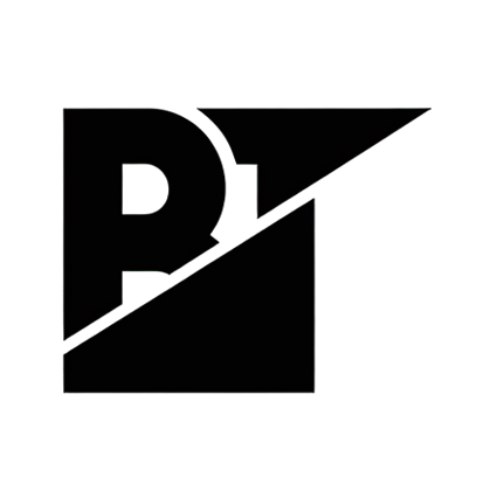
B — Historical Roots
The B represents Burak, my foundation.
It’s where every story begins, grounded in truth, heritage, and identity.
T — The Message
The T represents Told, as in Burak Told.
Its top line stretches outward like a telegram —
symbolizing the message every brand delivers to the world.
The Triangle — Perspective Shift
Some see a triangle as a wall, a barrier.
But if you change your perspective, it’s just a hill to climb.
Growth is rarely linear; it’s a journey of reframing obstacles.
The Upward Line — Momentum
Separating the B, T, and triangle is a rising diagonal line.
It’s the upward trend, a visual reminder that even small steps create growth.
Why It Matters
“This isn’t just a logo. It’s a case study in philosophy.”
This logo will never be “perfect.”
But its imperfection is what makes it authentic.
For me, this design represents three core beliefs:
Every brand is a story, not just a visual.
Meaning matters more than surface-level aesthetics.
The messy process of creation is what makes brands truly powerful.
When I create a brand, my goal isn’t to hand them a trendy logo.
It’s to unearth their story, to design from the inside out.
Closing Reflection
This logo may not be perfect.
It wasn’t designed to be.
It was built through questions, collaboration, and reflection —
the same process I use to grow.
Because at the end of the day, branding isn’t just about being seen.
It’s about being understood.

